Showing posts with label Font Combinations. Show all posts
What are color fonts?
Font
,
Font Combinations
,
Fonts.
,
Graphic design
,
Graphic design trend
,
Tutorials
,
Typography
,
Web design
Fonts are an essential element of any design. There are fonts
for every type of design project. So
what color do they have? Black of course. So then what are color fonts? Any
guesses.
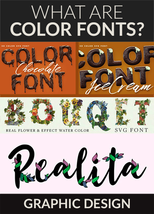


A beautiful color font best for monogram, wedding, quotes, logo, doodle, heading, title, etc. You get Realita font, Realita Floral font, Realita Colored font (Color Font) Realita Shadow.
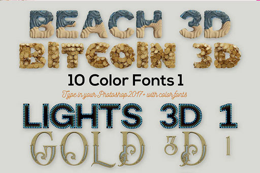


Color font with outline color. Works best with neon colors. You can use it for logo, headlines, flyers, covers, social media, etc.

All the Fonts you need and many other design elements are available for a monthly subscription by subscribing to Envato Elements. The subscription costs $16.50 per month and gives you unlimited access to a massive and growing library of 1,500,000+ items that can be downloaded as often as you need (stock photos too)!
Affiliate Disclaimer: This post contains affiliate links and I will be compensated if you make a purchase after clicking on my links. As an Amazon Associate and Envato elements associate, I earn from qualifying purchases. This will not cost you a single penny extra. Thanks for the understanding and rewarding me for my hard work.

What are color fonts?
Color fonts are an evolutionary step in the world of fonts.
When your design requires detailed and precise work for type first thing that
we need to need to do is to convert them into vector path. Right. However, with
color fonts, you don't have to do all this. Color fonts have color, gradients,
and textures inbuilt. Color fonts are also known as OpenType-SVG fonts or chromatic fonts or SVG color fonts. There are 2 versions of fonts vector and bitmap. Vector fonts look clean, crisp, and clear when scaled
to any size. Bitmap version however gets pixeled.
Why would you use color fonts?
Color fonts are going to the next big trend in web and design. Now, these have that flair that attracts anyone's attention instantly. They are made so that you don't have to go that extra mile like you have to with our regular fonts. It saves time while providing awesome results.
Color fonts are going to the next big trend in web and design. Now, these have that flair that attracts anyone's attention instantly. They are made so that you don't have to go that extra mile like you have to with our regular fonts. It saves time while providing awesome results.
What are the limitations of using color fonts?
Since color fonts are at an early stage most browsers don't support them yet. Before using them check if it is supported by all web browsers. If the browser doesn't support color fonts then you will be able to view the standard OpenType version. Make sure the fallback version is good enough. You can currently view color fonts on more recent versions of Firefox (from version 26) and Microsoft Edge (from version 38 on Windows 10). Color fonts are heavier than OpenType. They carry an extra amount of data which affects the loading time of websites and apps. so use it in a way that will not hamper your loading time.
Since color fonts are at an early stage most browsers don't support them yet. Before using them check if it is supported by all web browsers. If the browser doesn't support color fonts then you will be able to view the standard OpenType version. Make sure the fallback version is good enough. You can currently view color fonts on more recent versions of Firefox (from version 26) and Microsoft Edge (from version 38 on Windows 10). Color fonts are heavier than OpenType. They carry an extra amount of data which affects the loading time of websites and apps. so use it in a way that will not hamper your loading time.
Where can you use color fonts?
These can be used in all your print, app, and web designs. For the web however there ate limitations as stated above.
These can be used in all your print, app, and web designs. For the web however there ate limitations as stated above.
Where can you find color fonts?
You can find premium color fonts on Envato Elements. They have a huge collection of premium color fonts. There is a font to suit any type of design project. For a monthly subscription, you'll have unlimited access to thousands of SVG color fonts, sound effects, graphic templates, stock photos, and more.
So let's check out some of my picks,

let's start with sweet. This is a sweet chocolatey font. Best for your chocolate, holiday, bakery, confectionery themed design projects.
Super yummy color font. This font has 2 versions. Best for your cooking related design projects. Can fit in your holiday, cooking, baking themed design projects.


I scream ice cream color font. Best for your ice cream related design projects. It has a look and feels of choco bar ice cream.

This is a color font full of corn flakes. This color font has 2 versions. Best for your food-related design projects. Makes perfect headlines and headers for food projects.


You can find premium color fonts on Envato Elements. They have a huge collection of premium color fonts. There is a font to suit any type of design project. For a monthly subscription, you'll have unlimited access to thousands of SVG color fonts, sound effects, graphic templates, stock photos, and more.
So let's check out some of my picks,
Chocolate Color Font
let's start with sweet. This is a sweet chocolatey font. Best for your chocolate, holiday, bakery, confectionery themed design projects.
Get this font NOW
Corn Fruit Loops Color Fonts
Super yummy color font. This font has 2 versions. Best for your cooking related design projects. Can fit in your holiday, cooking, baking themed design projects.
Get this font NOW
Bouqet Flower & Watercolor
I absolutely adore this color font. This font is made of flowers. This font has 2 versions Real flower version and flower color water effect. This font is compatible with all versions of photoshop. Can be used in projects such as wall art, elegant branding, websites, digital media, weddings, apparel, packaging, invites, merchandise designs, etc.Get this font NOW
Ice Cream Color Font
I scream ice cream color font. Best for your ice cream related design projects. It has a look and feels of choco bar ice cream.
Get this font NOW
Corn Flakes Color Fonts
This is a color font full of corn flakes. This color font has 2 versions. Best for your food-related design projects. Makes perfect headlines and headers for food projects.
Get this font NOW
Cookie Color Font
Color font made of cookies. Yum. Sorry but you can not eat it but you can definitely use it
in your food-themed design projects.
Get this font now
Bluesky SVG Font
This font has a blue color but you can easily change it yo any color easily. This has a hand-lettering 3d style. Color font
best for logotype, display, title, packaging, headline, poster, Bussiness card
and etc.
Get this font now
Snowy - Winter Floral Color Font
Really nice decorative san serif font. Best for the Christmas Holiday theme. Perfect for the headline, Holiday card, postcard, Banner,
Logo, Poster, web, and many more.
Get this font now
Realita Color Font
A beautiful color font best for monogram, wedding, quotes, logo, doodle, heading, title, etc. You get Realita font, Realita Floral font, Realita Colored font (Color Font) Realita Shadow.
Get this font now
10 Color SVG Fonts 1
This is a complete bundle of 10 fonts. Each font has a
unique style.
Get this font now
Haext is neo-Goth rustic Art Nouveau, the part rune part
craftsman. The font has a unique style.
Get this font now

This is a modern unusual, wide, and straight font. Best for logos, art print, t-shirts, mugs,
etc. The geometry style makes it modern and appealing.
Get this font now

Locus Sans is a unique all-caps display font. This is
Available in six styles, and 3 color fonts. Combine 2 or more styles
to create vibrant typography effects.
You can also add color combinations to make appealing designs. Best for high
impact graphic design, editorial design, branding and web design.
Get this font now

Geometricity is a geometric display color font. This typeface made with basic shapes. Geometric
shapes gives the font a modern look and feel. Can be used in any modern design
projects.
Get this font now

The font gives the feel of under construction with lines seen on
the letters. Best for logo, headlines,
t-shirts, flyers, etc.
Get this font now
Ice Age Color Fonts
Icy cool 3d color font. This font comes in 2 styles. Best
for ice-themed design projects.
Get this font now

The font in the style of balloons. Cheerful font is available in 2 versions. Best for part themed design
projects.
Hikou Outline
Color font with outline color. Works best with neon colors. You can use it for logo, headlines, flyers, covers, social media, etc.
These were some of my picks but there are hundreds of fonts at Envato elements to suit every need. Please check them out HERE
All the Fonts you need and many other design elements are available for a monthly subscription by subscribing to Envato Elements. The subscription costs $16.50 per month and gives you unlimited access to a massive and growing library of 1,500,000+ items that can be downloaded as often as you need (stock photos too)!
Affiliate Disclaimer: This post contains affiliate links and I will be compensated if you make a purchase after clicking on my links. As an Amazon Associate and Envato elements associate, I earn from qualifying purchases. This will not cost you a single penny extra. Thanks for the understanding and rewarding me for my hard work.
Practice and play around with these fonts and 1 day you will be able to create awesome art with it in a professional manner and become a Really Creative Graphic Designer.
5 Best Google Font Pairs
Font
,
Font Combinations
,
Font pairs
,
fonts
,
Graphic design
,
how to
,
Tutorials
,
Type
,
Typography
,
Web design
Font are an integral part of any design project. Fonts convey mood and emotion of the design.

It is thus very important to choose fonts wisely. Equally important is to pair the font wisely. Not all fonts go well together. Like in our world not all people go well together. There are some who look good together likewise there are some fonts those look good together. Designers are always striving to find those best pairs to make their designs look professional.
Today I will go through 5 best Google web font pairs. They are widely used yet make their mark every time.

It is thus very important to choose fonts wisely. Equally important is to pair the font wisely. Not all fonts go well together. Like in our world not all people go well together. There are some who look good together likewise there are some fonts those look good together. Designers are always striving to find those best pairs to make their designs look professional.
Today I will go through 5 best Google web font pairs. They are widely used yet make their mark every time.

1) Lato and Open sans : Most widely used fonts but they go well together. Looks nice and clean. Both of them are Sans serif fonts. Both of them look professional for web design projects as well as print projects.


2) Montserrat and Roboto: Both of them are Sans serif fonts. Montserrat has a bit of small height while Roboto has an adequate height. This makes a good contrast and make your design stand out.


3) Muli and Open sans: Muli and roboto go well together. Muli has a soft feel and adequate height. Thickness of the font is just right. Roboto regular make a good combination with muli. The contrast in thickness of both the fonts is just right to make them go well together.

4) Roboto and Raleway: Roboto Medium has just right thickness to go well with raleway regular. Raleway has a sleek look to it which make it look professional. Try it in your project and see the magic.


4) Roboto and Raleway: Roboto Medium has just right thickness to go well with raleway regular. Raleway has a sleek look to it which make it look professional. Try it in your project and see the magic.

5) Merriweather and Montserrat: Merriweather is serif font while Montserrat is a Sans serif font. The contrast between serif and sans serif font make a perfect combination.

So those were my 5 best Google font pairings. The fonts used were lato, open sans, Montserrat, Merriweather, muli, roboto and raleway. All together 7 fonts to make up 5 combinations. The fonts I have selected are the ones which are most popular Google fonts right now. All of the fonts have a professional look to them which make your design professional. There are hundreds and thousands of fonts available but any design project requires the use of more than 1 font. It is a very crucial task to select the right font pairs. Do some research and play around with different font pairings to get it done right. You don't have to stick with what are declared to be the perfect pairs. Go ahead create your own set of font pairs. Also it is important to study the nature of each font which will help you to pair it with a font that is similar or contrasting in nature.

So those were my 5 best Google font pairings. The fonts used were lato, open sans, Montserrat, Merriweather, muli, roboto and raleway. All together 7 fonts to make up 5 combinations. The fonts I have selected are the ones which are most popular Google fonts right now. All of the fonts have a professional look to them which make your design professional. There are hundreds and thousands of fonts available but any design project requires the use of more than 1 font. It is a very crucial task to select the right font pairs. Do some research and play around with different font pairings to get it done right. You don't have to stick with what are declared to be the perfect pairs. Go ahead create your own set of font pairs. Also it is important to study the nature of each font which will help you to pair it with a font that is similar or contrasting in nature.

Typography as simple as Possible
Font
,
Font Combinations
,
Font pairs
,
Fonts.
,
Tutorials
,
Type
,
Typography

Typography is the art of working with text.Text is an important part of any design project as it conveys the message in plain language and also compliments the images. It is important to style your text in a manner that is appealing but also is legible and can be grasped in one sight.
So lets start to understand some parts or features of text. First of all there are different types of fonts they are :
Serif : These have little stokes attached to the main body of the letter. They have more of a classic look and feel to it. They are most commonly used in print projects.

Sans Serif : These fonts do not have little stokes attached to the main body of the letter. Sans is a french word which means without hence it means without serifs. They have more of a Modern look and feel to it. They are most commonly used in web projects. They are easy to read and understand in one sight.

Sans Serif : These fonts do not have little stokes attached to the main body of the letter. Sans is a french word which means without hence it means without serifs. They have more of a Modern look and feel to it. They are most commonly used in web projects. They are easy to read and understand in one sight.
Display : These fonts are decorative in nature.They are used mostly for titles,Headers and graphic heavy design.They come in various forms such as script,blackletter,allcaps and fancy text.

Then there are some features of text that you need to know in order to make you text appealing and legible.They are :
Leading : It is the space between lines ie line spacing.It is important to have just right spacing between the lines. Too less spacing make text hard to read while too much make it even worse.The spacing should be such that the text could be read easily without any confusion or putting strain on the eyes.

Tracking : It is the space between characters ie characters spacing.You can adjust your tracking to create artist effects.It can also be used to correct the spacing between some fonts which have bad tracking by default.

Kerning : It is the spacing between character sets is between specific characters.It varies from word to word because each character fits differently with other character.Tracking is space between overall character while kerning is space between specific characters.I found a great tool to improve your kerning skills check it out http://type.method.ac/#

It is important to consider the nature of project and choose the type that suits it.Just because you can use so many different fonts and different types of fonts doesn't means that you over use it. It is best to use only 2 types of fonts in any design project. If you need to add some variation use different font size and weight of the same font.Use proper hierarchy in your design to emphasize on the text you want to stand out against other text in the design. Make such hierarchy that will guide the users eyes where you want them to be looking first and follow eventually to the rest of the text.
Try experimenting with different font combinations. Don't be afraid to try some new combination.Common combinations includes Serifs with sans serif,Decorative with sans,Short with tall etc. Use inspiration from web and established artists.
At last there are some fonts that have been black listed because of their over use. some of which includes comic sans,curlz,papyrus,brush script,jokerman,kristen,itc,hobo etc. Check them online to get a full list of this fonts.
Experiment with and play with font and its types and eventually you will become good with using type in professional manner and become a Really Creative Graphic Designer.
Leading : It is the space between lines ie line spacing.It is important to have just right spacing between the lines. Too less spacing make text hard to read while too much make it even worse.The spacing should be such that the text could be read easily without any confusion or putting strain on the eyes.
Tracking : It is the space between characters ie characters spacing.You can adjust your tracking to create artist effects.It can also be used to correct the spacing between some fonts which have bad tracking by default.
Try experimenting with different font combinations. Don't be afraid to try some new combination.Common combinations includes Serifs with sans serif,Decorative with sans,Short with tall etc. Use inspiration from web and established artists.
At last there are some fonts that have been black listed because of their over use. some of which includes comic sans,curlz,papyrus,brush script,jokerman,kristen,itc,hobo etc. Check them online to get a full list of this fonts.
Experiment with and play with font and its types and eventually you will become good with using type in professional manner and become a Really Creative Graphic Designer.
Subscribe to:
Posts
(
Atom
)